Heatmaps: Understand Where Users Click Most is all about diving into the colorful world of heatmaps and why they matter for your website. You’ll discover how these nifty tools show you exactly where users are clicking, scrolling, and engaging on your site. It’s like having a map that leads you straight to the treasure of user insights. Get ready to learn how to make your website better and keep those visitors coming back!

What Are Heatmaps and Why Do They Matter?
Understanding Heatmaps in Simple Terms
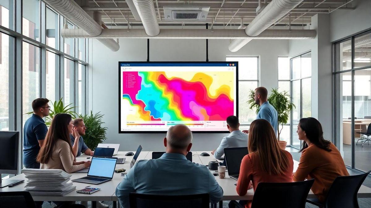
Heatmaps are like colorful maps that show you where people are clicking on your website. Imagine you have a treasure map, and instead of X marking the spot, you see bright colors showing where the most action is happening. The brighter the color, the more clicks that area gets. This helps you see what grabs your visitors’ attention and what doesn’t.
The Importance of Heatmaps in Website Optimization
Using heatmaps is a smart move for anyone looking to improve their website. They give you a clear picture of user behavior. With this information, you can make changes that can lead to more sales or sign-ups. Think of it like tuning a guitar; you need to know which strings are out of tune to create beautiful music.
Here’s a quick breakdown of why heatmaps matter:
| Why Heatmaps Matter | Benefits |
|---|---|
| Visual Insight | See where users click the most |
| User Experience | Improve how visitors interact |
| Data-Driven Decisions | Make changes based on real user data |
| Increase Conversions | Turn more visitors into customers |
How Heatmaps Help You Improve User Engagement
Heatmaps can significantly boost your user engagement. When you know where people are clicking, you can place important elements right in those spots. If you see a lot of clicks on a certain button, maybe it’s time to make that button stand out even more.
For example, if many users are clicking on an image that isn’t linked, consider making it a clickable link. This simple change could lead to more people exploring your site or buying your product.
In short, heatmaps are your best friend when it comes to understanding your audience. They help you see what’s working and what’s not, guiding you to make smart choices that can really pay off.
How Heatmaps Show User Click Tracking
The Basics of User Click Tracking with Heatmaps
Have you ever wondered where your visitors are clicking on your website? Heatmaps are a fantastic tool that helps you visualize this. They show you where users click the most, using colors to represent activity. For example, red areas indicate lots of clicks, while blue areas show little to no activity. This way, you can easily see what grabs attention and what gets ignored.
What Click Heatmap Analysis Reveals About Your Visitors
Analyzing click heatmaps can be a game changer for your website. They reveal patterns in user behavior. Here’s what you might discover:
- Popular Areas: You’ll see which buttons or links are the most popular.
- Ignored Sections: Some parts might be getting zero clicks, indicating they need a redesign.
- User Preferences: You can learn what your visitors like or dislike, helping you tailor your content accordingly.
Using Click Data to Enhance Your Website Design
Once you have your heatmap data, it’s time to put it to work! Here are some ways to use this information to improve your site:
| Action | Description |
|---|---|
| Rearrange Elements | Move popular items to more visible areas. |
| Improve CTAs | Make your call-to-action buttons more appealing based on where users click. |
| Revamp Content | If some content is ignored, consider changing it or placing it differently. |
By using click data wisely, you can create a more engaging experience for your visitors. This not only keeps them coming back but also helps turn them into loyal customers.

Visual Web Analytics: Making Sense of User Behavior
What is Visual Web Analytics?
Visual Web Analytics is all about seeing how users interact with your website. Instead of just looking at numbers and charts, it helps you visualize the data. This means you can actually see where people click, scroll, and spend their time. It’s like having a map of user behavior right in front of you!
How Heatmaps Fit into Visual Web Analytics
Heatmaps are a key part of visual web analytics. Think of them as colorful maps that show you where users are most active on your site. The hotter the color, the more clicks or engagement that area gets. This helps you understand what catches your visitors’ attention.
Here’s a simple table to illustrate how heatmaps work:
| Color | User Activity Level |
|---|---|
| Red | High (lots of clicks) |
| Orange | Medium (some clicks) |
| Yellow | Low (few clicks) |
| Green | Very Low (minimal clicks) |
The Benefits of Visualizing User Interaction Data
Visualizing user data has many benefits. Here are a few:
- Understand User Behavior: You can quickly spot what users like or dislike.
- Improve Design: If a button isn’t getting clicks, maybe it needs to be moved or changed.
- Boost Engagement: By knowing where users click, you can place important information where they will see it.
Using heatmaps helps you to focus on what matters. You can make changes based on actual user behavior instead of guessing. This means your website can become more user-friendly and effective.
The Different Types of Heatmaps You Can Use
Click Heatmaps vs. Scroll Heatmaps
When diving into heatmaps, you’ll find two main types: Click Heatmaps and Scroll Heatmaps.
- Click Heatmaps show where users are clicking on your website. They highlight the spots that get the most attention. This is important because it helps you see what grabs your visitors’ interest. For example, if you notice a lot of clicks on a button, you might want to keep it right where it is!
- Scroll Heatmaps, on the other hand, reveal how far down the page users scroll. This tells you if people are engaging with your content. If most users stop scrolling halfway down, it might be time to rethink your layout or content placement.
Here’s a simple table to break it down:
| Heatmap Type | What It Shows | Why It Matters |
|---|---|---|
| Click Heatmap | Where users click | Helps you identify popular links |
| Scroll Heatmap | How far users scroll | Shows if your content keeps interest |
Understanding Attention Heatmaps
Next up, we have Attention Heatmaps. These are a bit different. They track where users spend the most time on your page. If a section of your content has a lot of activity, it means it’s capturing attention.
Imagine you have a blog post about gardening. If users linger on tips for growing tomatoes, you know that’s a hit! This insight can help you create more content that resonates with your audience.
Choosing the Right Heatmap for Your Needs
Now, how do you pick the right heatmap? It really depends on what you want to find out. If you’re curious about user clicks, go with a Click Heatmap. Want to know if people are reading your whole article? A Scroll Heatmap is the way to go.
Consider these questions:
- What do you want to learn about user behavior?
- Are you focusing on clicks, scroll depth, or attention?
By answering these, you can choose the heatmap that best fits your goals.

How to Use Heatmap Software Effectively
Top Heatmap Software Options Available
When you’re diving into heatmaps, you’ll find several great tools out there. Here’s a handy table to help you compare some of the top options:
| Software | Key Features | Price Range |
|---|---|---|
| Hotjar | Click tracking, scroll tracking | Free to $89/month |
| Crazy Egg | A/B testing, user session recordings | $24 to $249/month |
| Mouseflow | Form analytics, funnels | $29 to $399/month |
| Lucky Orange | Live chat, surveys | $10 to $150/month |
These tools can help you see where users click the most and how they interact with your site.
Steps to Set Up Heatmap Tracking on Your Website
Getting started with heatmap tracking is easier than you might think. Here’s a simple guide to help you set it up:
- Choose Your Software: Pick one from the list above that fits your needs.
- Sign Up: Create an account on the chosen platform.
- Add Tracking Code: Follow the instructions to add the tracking code to your website. This code is usually placed in the header or footer.
- Configure Settings: Set up your heatmap preferences, like which pages to track and the duration.
- Start Tracking: Let the tool gather data for a few days to get a clear picture of user interactions.
Tips for Getting the Most Out of Heatmap Tools
To really make your heatmap tools shine, keep these tips in mind:
- Focus on Key Pages: Start with your most important pages, like landing pages or checkout pages.
- Analyze Regularly: Check your heatmaps often to spot trends and changes.
- Combine with Other Tools: Use heatmaps alongside analytics tools for a fuller picture.
- Test Changes: After making updates to your site, compare the heatmaps to see if user behavior improves.
By following these steps and tips, you’ll be well on your way to understanding where users click most on your website.
Analyzing Visitor Engagement Metrics with Heatmaps
What Are Visitor Engagement Metrics?
Visitor engagement metrics are like the breadcrumbs that show you how people interact with your website. They help you understand what visitors do while they’re on your site. Key metrics include:
- Click-through rates: How many visitors clicked on your links?
- Time on page: How long did they stick around?
- Bounce rates: Did they leave quickly or explore more?
These numbers tell you a lot about your audience’s interests and behaviors. The more you know, the better you can connect with them.
How Heatmaps Help You Measure Engagement
Heatmaps are a visual tool that shows you where users click the most on your website. Think of them as colorful maps that highlight hot spots of activity. Here’s how they can help:
- Identify popular areas: You can see which buttons or links get the most attention.
- Spot trouble spots: If visitors aren’t clicking on something important, it might need a redesign.
- Understand scrolling behavior: You can tell how far down the page users scroll.
Using heatmaps, you can create a more engaging experience for your visitors.
Interpreting Engagement Data for Better Results
Once you have the data from heatmaps, it’s time to dig in. Here’s a simple table to help you interpret the information:
| Heatmap Color | Meaning | Action to Take |
|---|---|---|
| Red | High Engagement | Keep or enhance this content |
| Yellow | Moderate Engagement | Consider tweaking design or content |
| Green | Low Engagement | Reevaluate placement or relevance |
By looking at these colors, you can make smart decisions. For example, if a button isn’t getting clicks, maybe it’s time to change its color or position.

Data-Driven Design Insights from Heatmaps
How to Gather Insights from Heatmap Data
Heatmaps are like maps that show you where users click the most on your website. They help you see what grabs attention and what gets ignored. To gather insights from heatmap data, start by using a reliable heatmap tool. Some popular options include Crazy Egg, Hotjar, and Mouseflow. Once you set it up, you can start collecting data. Here’s how:
- Install the Tool: Follow the instructions to add the heatmap tool to your website.
- Track User Behavior: Let the tool run for a few weeks to get enough data. The more data, the better your insights will be.
- Analyze the Heatmap: Look at the colors on the map. Red means lots of clicks, while blue means few clicks.
Making Design Changes Based on Heatmap Insights
Once you have your heatmap data, it’s time to make changes. Here’s how to do it effectively:
- Identify Hotspots: Focus on areas with lots of clicks. These are your hotspots. Consider keeping important content or buttons there.
- Revise Cold Spots: If certain areas are getting ignored, think about redesigning them. Maybe they’re not eye-catching enough.
- Test Changes: After making changes, watch how users react. Use another heatmap to see if the new design works better.
| Action Step | Purpose |
|---|---|
| Identify Hotspots | Keep important content visible |
| Revise Cold Spots | Improve areas that get ignored |
| Test Changes | Ensure the new design is effective |
The Impact of Data-Driven Design on User Experience
When you use heatmaps, you’re not just making guesses. You’re making smart decisions based on real data. This can greatly improve user experience. For example, if you notice that users click on a specific button often, you might want to make it bigger or change its color to make it stand out even more.
A good user experience keeps people on your site longer and encourages them to return. Think of it like a warm welcome when someone enters your home. You want them to feel comfortable and engaged. By leveraging heatmaps, you can create a space that feels inviting and easy to navigate.
Common Mistakes to Avoid with Heatmap Analysis
Misinterpreting Heatmap Data
When diving into heatmaps to understand where users click most, it’s easy to get things mixed up. You might see a lot of clicks in one spot and think, Wow, everyone loves this! But hold on! It could be that users are confused or lost. They might be clicking because they’re trying to find something, not because they love what they see.
For example, if a button is hard to find, users might click around it a lot. This doesn’t mean they want to click it; it means they can’t figure out where to go next. To avoid this pitfall, always ask yourself what those clicks really mean.
Overlooking Important User Behavior Patterns
Another common mistake is ignoring the bigger picture of user behavior. Heatmaps show you where people click, but they don’t tell the whole story. You might notice clicks in a certain area, but what about scroll depth? Are users even reaching that part of the page?
Understanding user journeys is key. If you see a lot of clicks but low engagement, it’s time to dig deeper. Look at how users navigate your site. Are they bouncing back? Are they spending time reading your content?
Best Practices for Accurate Heatmap Analysis
To get the most out of your heatmap analysis, keep these best practices in mind:
| Best Practice | Description |
|---|---|
| Combine Data Sources | Use heatmaps with other tools like Google Analytics for a full picture. |
| Focus on User Goals | Understand what users are trying to achieve on your site. |
| Regularly Review Heatmaps | Check heatmaps often to catch changes in user behavior. |
| Test and Iterate | Make changes based on your findings and see how users respond. |
By following these practices, you’ll get a clearer view of how users interact with your site. Remember, heatmaps are a powerful tool, but they need context to shine.

The Future of Heatmaps in Website Optimization
Emerging Trends in Heatmap Technology
Heatmaps are becoming a game-changer in understanding user behavior. They give you a clear picture of where users click, scroll, and spend time on your website. This is crucial for improving user experience.
One exciting trend is the rise of dynamic heatmaps. Unlike traditional heatmaps, which show static data, dynamic heatmaps update in real-time. This means you can see how users interact with your site as it happens. Imagine being able to tweak your website on the fly based on what users are doing right now!
How AI is Changing Heatmap Analysis
Artificial Intelligence (AI) is stepping into the heatmap arena, making analysis smarter. AI can sift through tons of data much faster than a human can. It helps you pinpoint patterns and trends that you might miss on your own.
For example, AI can analyze user paths on your site. It can show you not just where users click, but also the journey they take to get there. This insight allows you to make better decisions about your website’s layout and design.
Preparing for the Next Generation of User Interaction Mapping
As we look ahead, the next generation of heatmaps is all about user interaction mapping. This means going beyond just clicks and scrolls. You’ll want to track how users engage with videos, forms, and other interactive elements on your site.
Here’s a quick table to summarize the future trends in heatmap technology:
| Trend | Description |
|---|---|
| Dynamic Heatmaps | Update in real-time to show current user interactions. |
| AI-Powered Analysis | Uses AI to discover patterns and trends in user behavior. |
| Interaction Mapping | Tracks engagement with various site elements beyond clicks. |
By embracing these trends, you can stay ahead of the curve. Remember, Heatmaps: Understand Where Users Click Most is just the beginning. The future holds even more exciting possibilities!
Frequently Asked Questions
What are heatmaps?
Heatmaps show you where users click the most on your website.
How can heatmaps help my website?
Heatmaps: Understand Where Users Click Most can help you see what grabs attention. This helps you make better design choices.
Are heatmaps easy to use?
Yes! Most heatmap tools are user-friendly. You can get started without technical skills.
Can I track mobile users with heatmaps?
Definitely! Many heatmap tools track clicks on mobile devices too.
Do heatmaps show user behavior over time?
Some heatmaps do! They can show changes in user behavior over days or weeks.

Lucas is a technical SEO expert who has optimized over 200 websites and managed Google AdSense and Ad Manager campaigns since 2016. At ReviewWebmaster.com, he shares strategies to boost organic traffic and monetize every single visit.
Types of articles he writes:
-
“How to Increase Your Blog’s RPM with Simple Tweaks”
-
“Technical SEO Checklist for WordPress Sites”
-
“Complete Beginner’s Guide to Google Ad Manager”
Why it works:
Lucas brings a confident, analytical, and performance-driven voice to the site — perfect for readers looking for actionable, results-oriented content.
